Showing posts with label zachary cullen. Show all posts

Tuesday, December 8, 2009

Website: Zach Cullen


Design: I wanted this website to have a unified theme with my poster, so I incorporated elements from that design into the website. I used the cans from the poster as my navigation links, and for the active link I used a change in color and the orange ribbon for hunger awareness. I used the same bowl I drew for the poster on the home page and on other pages as well. I chose not to make it part of the Header because it was awkward and didn’t fit well.
I only used four links, but there are three pages for the third link, sign up. I decided to make this a multi-step process because I thought it made the experience more interactive and fun. On step one, the three bowls are buttons and the type turns orange when you click on it. The rectangles to the right are also buttons that turn orange when you click on them. When you proceed to the next page the bowl you chose appears, and you fill in the information. The third step, “Fill your bowl,” is a page that tells the user how to promote their drive and build excitement about the event, including a download of my poster.
I used grey rectangles as containers for information throughout, and sometimes to signify buttons. The ones that say things like “check out the documentary” and “get the facts” are links to the other pages on the website.

Typefaces: I chose the Futura typeface family for all of my type. I thought that it’s classy, readable, and fun. Futura condensed looks really good in all capitals, which I use throughout. I used the condensed bold for some bowls and in the header that says the name of the event. For regular text I used Futura medium, and for contrast in the headings I used Condensed medium.

Colors: The background color comes from the light blue background/sky in my poster. I created a texture using and image of stacked cans, which I adjusted to be black and white. I also increased the exposure and brightness to make it lighter.
I used dark grey for the text because with the lightness of the background and the white container, black had too much contrast. I used orange, the color of hunger awareness for various headers and for my active links. I used a medium blue for contrast with other headings.

Friday, December 4, 2009

Wrap Up : Zach Cullen

I really loved this class, it's probably the best class I've ever taken. I enjoyed it so much and learned so much already that I don't really care if I get an A. Coming into it, I was very excited because I love being creative but I really didn't know anything about graphic design. I was not disappointed, in fact, I learned way more than I expected too and created things I didn't think I would be capable of creating. For example, I did not expect to spend so much time thinking about typefaces but I've learned to really appreciate them. I feel like this class gave me some real concrete skills and knowledge that I can use and build on for the rest of my career and the rest of my life, unlike most of the classes that I take. I'm really glad that I got to create things I will actually use like the resume, the logo, and the poster. The long nights in the lab were tough (and they will be again this weekend when I do the last project) but it helped that I never suffered alone.

"The collective grumbling of all the poor, miserable, tired, hungry, and frustrated graphic students unified us and we wore our bloodshot eyes the next day like a badge of honor."

Yeah, that's a pull quote. WHAT NOW?! Hard times. Good memories. Graphics. period.

Hierarchy - Zach Cullen


This website really uses good hierarchy to organize a lot of information. The first thing that draws your eye is the big, bright, logo in the upper left followed by the title "THE FEAST" in the largest type on the page. The navigation tabs are along the same line, and stand out from the rest of the type on the page because they are bright pink. The most basic and important information is in the central container with the second largest type used. This container features the basic info along with a bright pink call-to-action button "Register Now" button. There are two other containers below that, each slightly smaller and duller in color so they don't compete with the central one. The left sidebars have large titles so they don't get lost, but they are on a white background so they don't compete. Overall this website has good hierarchy because it causes your eye to follow a logical path, it separates and distinguishes different pieces of information, and it is easy to read and understand.

Magazine Project: Zachary Cullen


Story and Art Direction:
I wanted to do a story on LeBron James because there plenty of high resolution photos of him. Mostly, I didn’t want to do a celebrity because I can’t stand them. The article I chose was not only about basketball but about LeBron as a global brand. I liked it because the author used a lot of imagery and fantastical descriptions that I thought would be good material for art direction.
I wrote the headline “In the King’s Court” because one of LeBron’s nickname is “King James.” The word court is a double entendre meaning court as in his ruling domain, the place he rules from, and the basketball court. The deck head leads up to this with a sentence “Then again, anything can happen... In the King’s court.” Also, I knew this was perfect when I found the image of LeBron actually dressed up as a king with Lions around him. In the first spread, the Deck head and Headline lead downward and into the page, mirroring the shape of the throne LeBron is sitting on. Also, the basketball court lines in the background sweep downward like the curtains in the opposite photo, creating symmetry that pulls the reader into the magazine no matter where the are looking.
In the second spread, I chose an image of LeBron and his agent Maverick Carter because the article spends a lot of time talking about their friendship and business partnership. I chose that particular picture because the warm colored wood and jersey match the color palette from the first image.
My side bar is about products LeBron endorses. I think it adds useful and humorous information to the article (for instance, why does LeBron endorse lawn mowers?). The pictures of the products I chose are also following the color pattern of red, yellow, and black.
For my cover I created “Baller Magazine” which is intended to be a basketball magazine, but also a young urban man’s interest magazine too, that’s why I included deck heads about video games, sneakers, etc. A “Baller” is someone who plays basketball, but it is also slang for a stylish urban guy who has money.
Typefaces:
Bauhaus: Used in demi on the cover and in regular on the folios. I chose it because it has a vintage appeal, which does not go out of style in basketball.
Helvetica: Used in bold on the cover to work with the title, and in the sidebar title to contrast with the Caxton, and used in regular in the caption to contrast body text.
Caxton Bold: I chose this for the headline because it looks kind of medieval because of the big horn like squarish serifs. I also used it on the Drop cap and in the side bar for continuity and contrast.
Berkeley Oldstyle: I used this for the deckhead because it is readable and contrasts slightly from the headline. It’s one of the 10 readable fonts.
Janson Text: I used this for the body paragraphs because it’s one of the 10 readable fonts and I like the chiseled look. It’s very neat when you use justify.

Thursday, October 29, 2009

Logo Project Zachary Cullen


First of all I just want to say that the color green in theses images looks really gross like boogers or vomit and that doesn't at all represent the color that I chose. Also I don't know why two of them look normal and one is all weird but I can't fix it until I can go back to the labs again tomorrow.

For my logo I wanted to create the letter Z using the gestalt principles of closure and figure ground. I also wanted the logo to have good proportions and have dynamic energy. I achieved this by sketching four triangles that create the overall shape of a convex parallelogram, but are moved apart to create a diagonal Z. Later, I was talking to someone and they said splat and I said "I have a splat personality." I then incorporated that into my design because I thought it was clever and would add the dynamic energy that my logo was lacking. I think it represents my personality well because I am kind of quirky and creative, but I also have a serious, intelligent side. Both the "split" and the "splat" are represented in my logo.

For my business card I used the name Z.A.Cullen because I think that since I have clever initials I might as well run with it. It also saved me the trouble of trying to place two words. I would rather brand myself as Z.A.Cullen because it's a little different from the multitude of other Zach's in my generation. I thought that using the quote on the back would be a good choice because it makes the business card more memorable. I used the triangles from my logo to create quotation marks and also put a little splat on the edge to use repetition and tie the quote to elements of my logo. I chose a grey background because with the heavy contrast of a huge logo in black, grey softens the look. I also think that grey works well with bright green. I wanted to get special paper but I didn't have time. If I ever ordered this card I would have it done on thick, grey paper.

For my stationary I wanted a clean and open stationary that just let my logo speak for itself. I chose to enter it because it looks better with the entered information at the bottom of the page. Also, I could put adress information on either side.

For my envelope I chose a basic layout witht he logo and the information in the upper left corner. I didn't want my envelope to be too fancy, because I feel like if you have an amazing envelope you may set really high expectations for the recipient and they will just be disappointed when they open it.

Typefaces: DIN 1451 Mittelschrift: I chose this font because I liked the double lower case l's in Cullen. I also liked that it is sans serif, which works with my geometric logo. It is a modern and masculine typeface.

DIN 30640 Std. Neuzeit Bold Condensed: I chose this for my contact information only on the business card because it contrasted a little bit with the type in my logo, and allowed me to fit the info onto a smaller horizontal portion of the business card.

Color: Pantone 382 EC (green) I chose this because I think green is the best color for a "splat." It's fun and it contrasts with the black well.

Friday, September 11, 2009

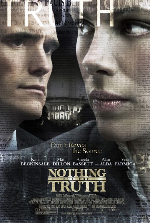
abomination of type


This is a great example of the damage that badly used type can really do. I watched a special presentation of this movie in the Herg last year and loved it, but judging by this poster I would assume the movie was a piece of garbage. To start, the words TRUTH and FACTS are both bleeding off the top of the page so that as soon as my eyes enter the page they are led off the top. Even worse, the big block letters of TRUTH being plastered across Matt Dillons' forehead only seems to emphasize the look of consternation on his face. There isn't really anything other than Kate Beckinsale's chin to lead us down the page, but if we do look there, we see the tagline, Don't Reveal the Source, first. It's a slightly transparent text on layers and layers of transparent newspaper print. Choosing a solid color and a sans serif font would have had a lot more contrast given the amount of distractions on this poster. The tagline is awkwardly floating above the actors names, which extend across the page, followed by the title which is very narrow. The title itself is not poorly designed, but the all caps serif font, which is very roman looking gives a sort of "Law & Order" feel instead of journalistic one. I think this poster missed. I would have designed it to be much simpler, and chosen fonts that were reminiscent of a typewriter or newsprint, giving the feel of of an interesting editorial debate rather than a boring legal drama.