Showing posts with label bad type. Show all posts

Saturday, September 19, 2009

Badly Used Type

Besides the fact that there is way too much going on within this advertisement. The many different uses of text, frankly bad use of text, and the total abomination of an image concretely makes this ad an ineffective one. My eye has no starting point or ending point besides the date header at the top. After that, it's all up for grabs.

Specifically commenting on badly used type, the designer should have used the same sans serif font from the date header in the type of the band's name or rather even use the serif font in the header and the sans as the band's name. To me, everything is competing in this ad for "visual time" with my eye and as a whole it lost the battle...I'm moving on.

Friday, September 11, 2009

abomination of type


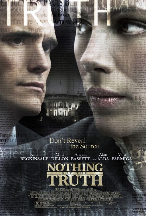
This is a great example of the damage that badly used type can really do. I watched a special presentation of this movie in the Herg last year and loved it, but judging by this poster I would assume the movie was a piece of garbage. To start, the words TRUTH and FACTS are both bleeding off the top of the page so that as soon as my eyes enter the page they are led off the top. Even worse, the big block letters of TRUTH being plastered across Matt Dillons' forehead only seems to emphasize the look of consternation on his face. There isn't really anything other than Kate Beckinsale's chin to lead us down the page, but if we do look there, we see the tagline, Don't Reveal the Source, first. It's a slightly transparent text on layers and layers of transparent newspaper print. Choosing a solid color and a sans serif font would have had a lot more contrast given the amount of distractions on this poster. The tagline is awkwardly floating above the actors names, which extend across the page, followed by the title which is very narrow. The title itself is not poorly designed, but the all caps serif font, which is very roman looking gives a sort of "Law & Order" feel instead of journalistic one. I think this poster missed. I would have designed it to be much simpler, and chosen fonts that were reminiscent of a typewriter or newsprint, giving the feel of of an interesting editorial debate rather than a boring legal drama.

Example of badly-used type


This summer I worked for SpaFinder, a spa marketing company, and came across so many spa/salon websites that needed a TON of work. This is an example of a header of one of these websites, for a spa located in Canton, Ohio. The word "Headliners" is a novelty font, using lines to accentuate the word. However, this draws attention solely to the word "Headliners," and makes "Salon & Day Spa" look lost. Also, the kerning in the "Salon & Day Spa" sentence should be larger so that the sentence lines up with the "Headliners" sentence above it. The script font is barely readable in the two places it is used. The bottom right side says "Relax, Refresh, Renew,"
which would be a good tagline to promote the spa, if only it was readable! The sans serif font listing the address and phone number seems to come out of nowhere since none of the larger words on the picture are quite so rounded. Also, the white color of the bottom line doesn't seem to stand out among the colors of the background. Overall, this website would not make me WANT to go to this spa. It is not eye-catching, and is more eye-confusing if anything due to the abundance of different font styles and sizes.